Client: Co-op Food Stores | White River Junction Store
Project: Wine Department Signage
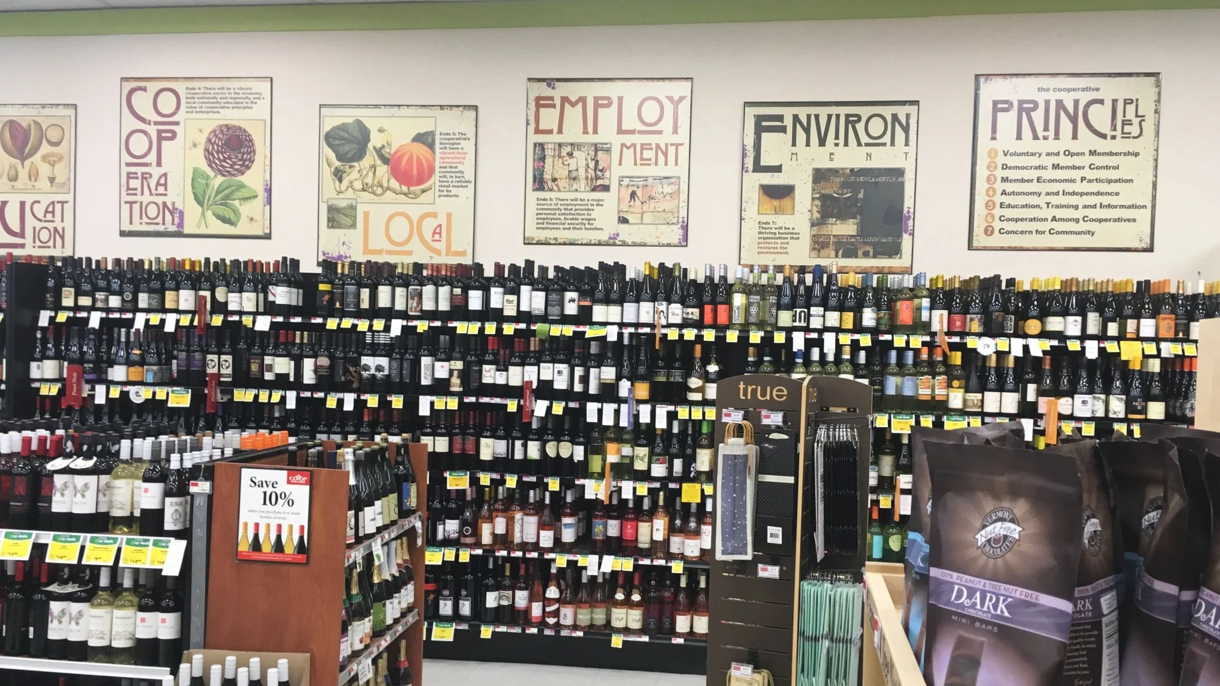
THE PROBLEM The informational artwork above the wine department became outdated and needed to be removed. This department also used wine category signage that extended out from the shelves. The signs continually got knocked down and the wine categories could not be seen as the shopper approached this department. The Wine Department manager requested new artwork for the wall above the department as well as a new method to display the wine categories.
Project budget: $500-$1,000
BEFORE - WINE WALL
DESIGNER’S ROLE April knew she didn’t have a big budget to work with on this project so she knew she would have to think outside the box. April also wanted to change the Wine Department wall in a way that not only enhanced the aesthetic of this department, but also gave a visual lift to the store environment. After initial brainstorming and online research for category signage and wine department environments, April created a Photoshop mockup of the wall showing the proposed signage. The Store Manager, Marketing Manger and Wine Department Manager all approved of the design direction. More internet research led April to Junk Art Gypszy on Etsy. They were able to make 24” metal letters for the store wine wall.
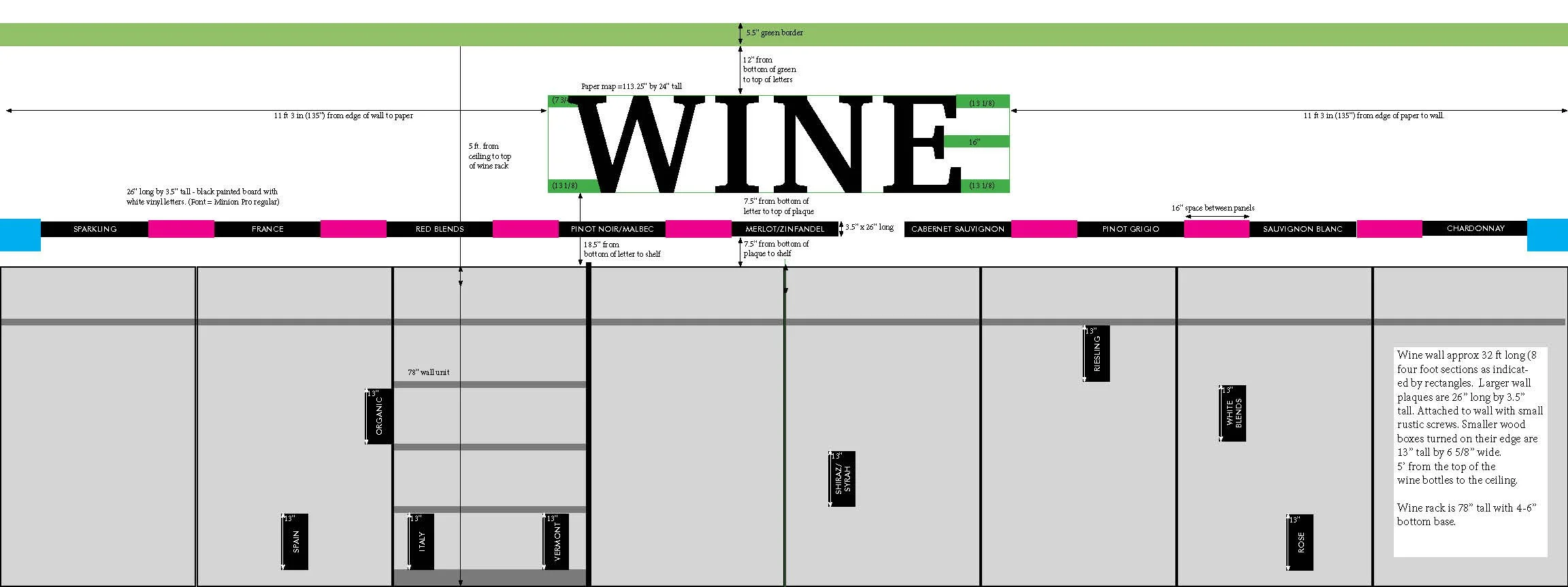
Next, April thought about the wooden wine crates used for shipping wine bottles. She turned one on its edge and found that it was the right size to fit within the shelves. April sourced enough wooden wine boxes from the other Co-op Food Store locations to create the 8 subcategory signs needed for this project. Working with Wine Department manager Dave Phillips, they identified headers for wine categories, and subcategories for shelf dividers. April decided on a dark walnut stain for the wooden crates and the custom wooden headers. April enlisted Red Door Signs to do the staining and lettering on these wooden elements. A trip to the local hardware store helped April find vintage blackened screws to use when hanging the wine headers. She didn’t want this little detail (like silver screws) distracting from the overall mood she was trying to create.
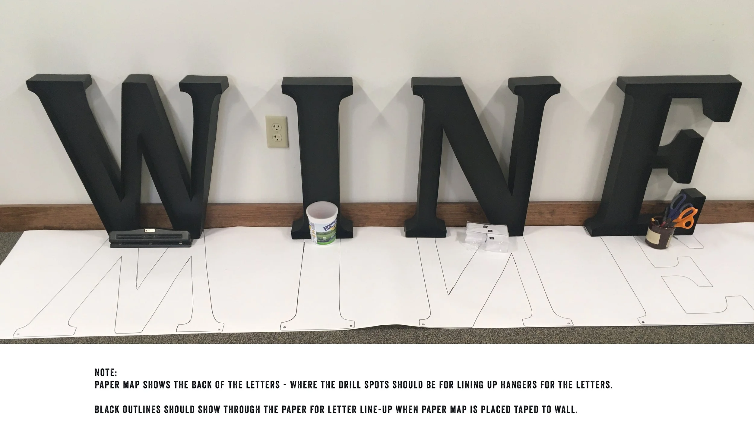
During the planning process, April created a schematic of the wall and new signage to ensure accurate placement. A paper map was created to aid the facilities team in the hanging process.
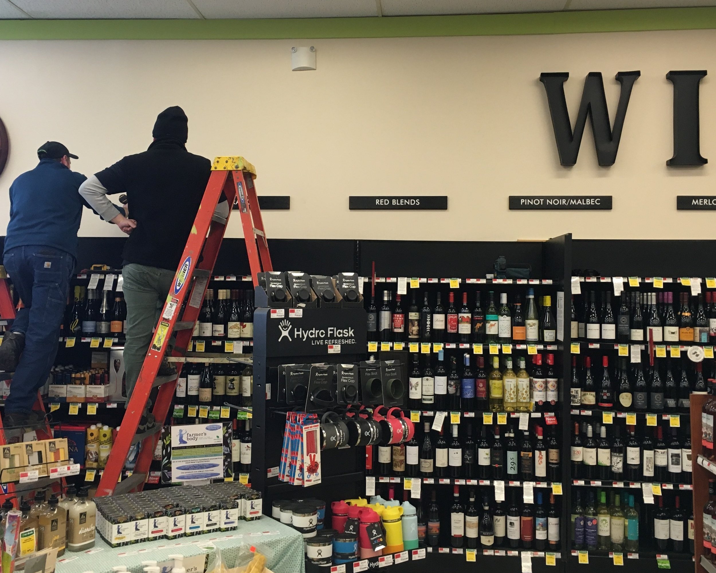
Installation
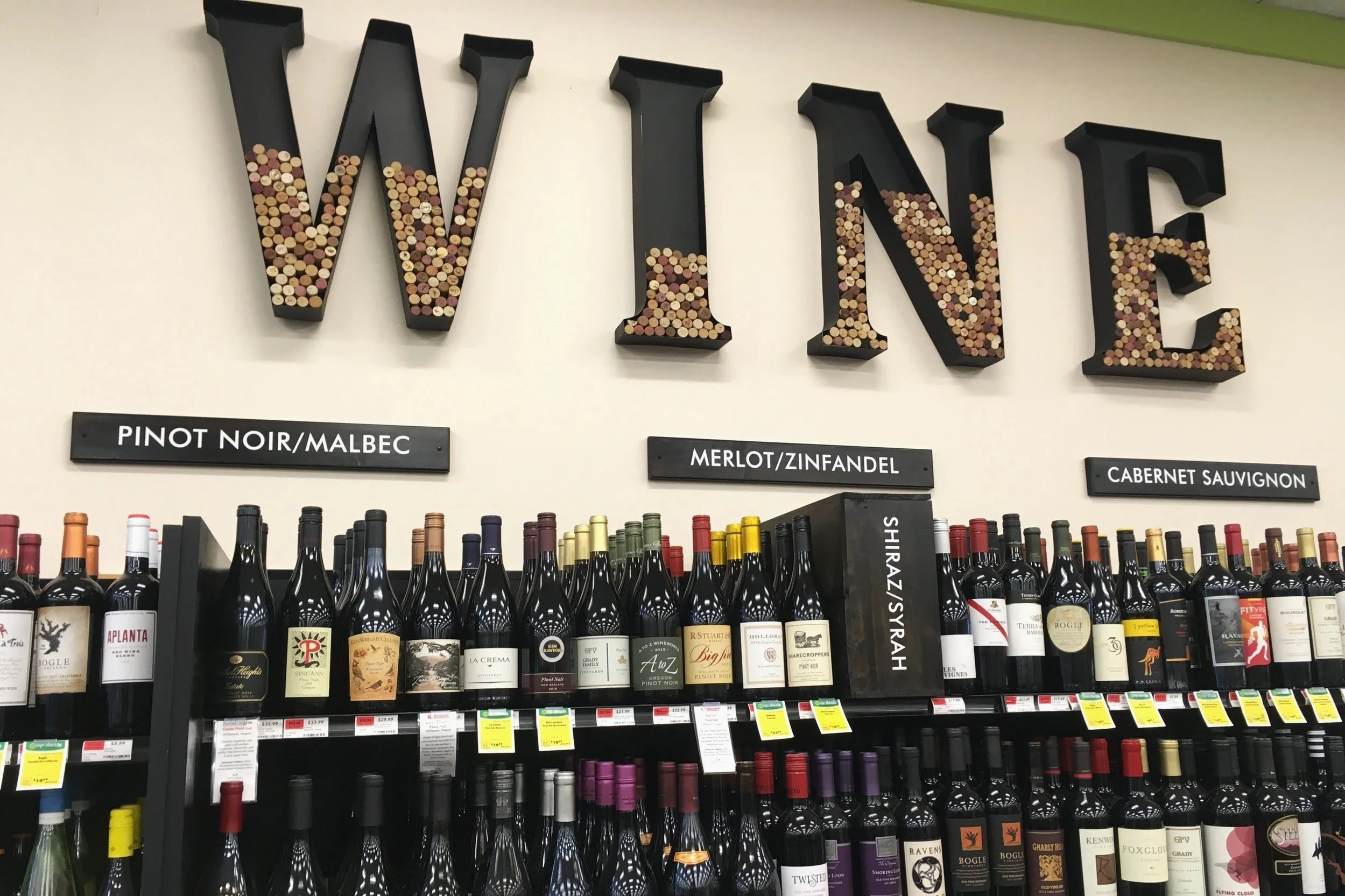
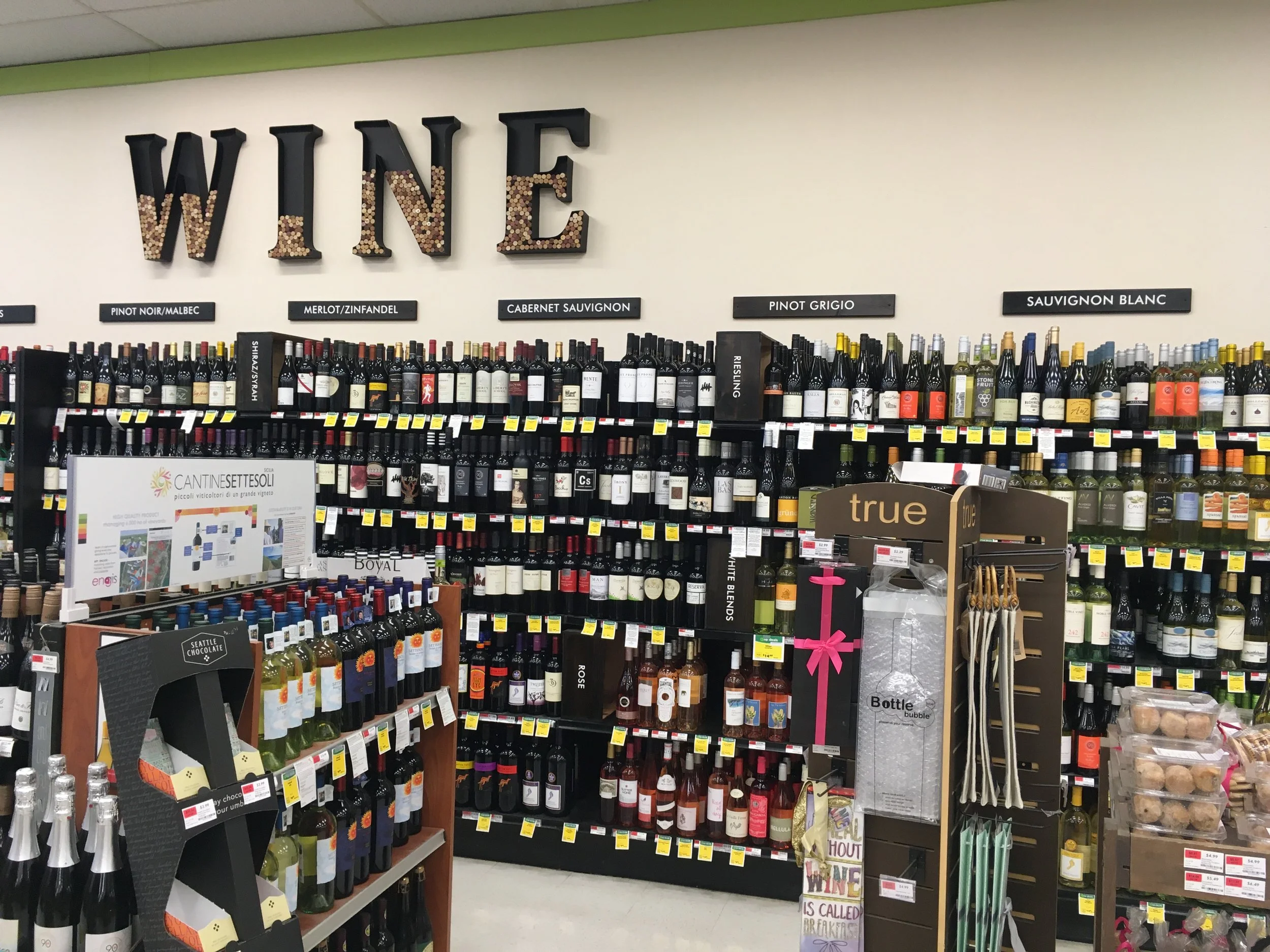
PROJECT OUTCOME The metal wine letters were filled with used wine corks as a texture element within the signage. The lighter color of the corks contrasts the darker color of the metal. The dark wood sign headers and wooden box subcategories further compliment the sophisticated but natural desired mood in this department. Shoppers are able to find their desired wine type more efficiently and signs are not getting knocked off the shelving.
Employees were excited about the upgrade to their store environment and it boosted moral. Employees were asked to guess how many wine corks it would take to fill the metal letters half way up.
COST SUMMARY
$500 for metal letters
$240 for revamping wooden boxes (wine countries/regions) and wine category top wood headings
AFTER - WINE WALL - Closeup of wine category headers and wooden box shelf categories
AFTER - WINE WALL

