Client: Co-op Food Stores
Project: Rebranding the voice and vibe of the Co-op
THE PROBLEM The Co-op Food Stores, started during the great depression is the second oldest food co-op in the United States (87 years). Over time, the messaging and vibe of the stores has become stagnant. In 2023, the Co-op hired a new Marketing Director. Her vision is to revive the messaging and vibe of the stores by paying tribute to the generation that started the Co-op and bring in the vibe of a younger Gen Y target audience.
Project budget: TBD
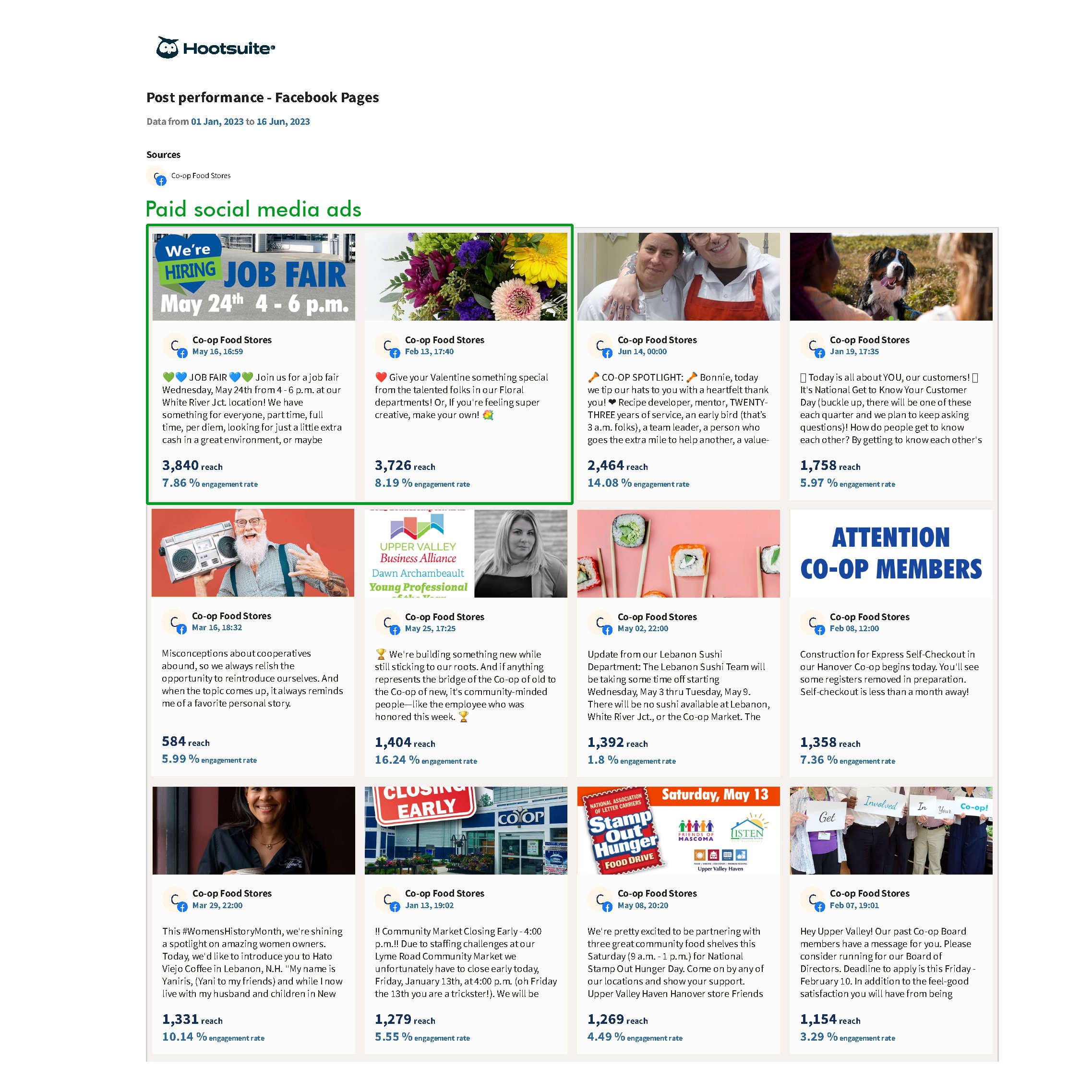
DESIGNER’S ROLE April’s role was to take this vision and create a strategy plan to roll it out to consumers. Step 1 - the Marketing Director enlisted the senior writer to craft messaging for email blasts that was easy to read, engaging, and funny. This writing style was upbeat, optimistic and insightful. April, then used the Co-op Social Media platforms to further connect with people. In addition to the once weekly email, social media was able to connect with audiences one-to-one. April saw the engagement numbers from posts start to rise from 3.09% to 4.26% in just the first month of this new messaging style. As of June, the average engagement rate has risen to 4%-6%. In addition to creating content for posts, April also engaged on social media with other co-ops, local vendors, and consumers that shared similar values to the Co-op.
Data-driven results
In 2023, Facebook engagement rates skyrocketed with content that aligned with the Co-op’s people-centric approach and community connection.
The next step was to design print ads for local magazines that would hit the stands March, July, October in 2023. (Image magazine, Quechee Times, Lebanon Times, Norwich Times). The concept for this ad campaign was to show youthful grandparents. Grandparents who were endearing and different. These personas exemplified our heritage as an organization and our youthfulness or leaning in to the interests of the next generation. Local foods and local vendors is something that the Co-op does better than competitors. It was important to get that messaging in the ads also. A simple green leaf is the symbol used to identify products that are grown or made in Vermont and New Hampshire.
Step 3 - Get this ad content in additional places to spread the new vibe of this message and reinforce the message. April’s plan was to do a Blog post (so that the Marketing Director and Writer could share the full vision of this rebranding effort without the constraints of space. Next, the two ads on the sides of buses would be updated. A store banner would be designed for the Lebanon store location. Posters would go within the other store space. Internal messaging would go out to staff in monthly newsletters (this new vibe is for them too!).
In a slow drip process, April’s plan is to align the co-op with the younger, different, sometime eccentric target audience. At the same time that the Co-op is “becoming younger”, the Co-op is consistent in it’s core cooperative principles.


